Data visualization is a cornerstone of turning complex information into actionable insights. When analyzing geographical or geospatial data, leveraging map-based tools such as polygons and polylines can significantly enhance clarity and decision-making. These tools allow users to visualize boundaries, routes, and spatial patterns on maps with precision. Whether you’re designing transportation networks, analyzing demographic data, or managing location-based services, map polygons and polylines offer practical methods for building robust and interactive visualizations.
This guide will explore how these elements work to ensure effective data visualization, their applications, and how tools like Azure Maps can streamline their integration.
Understanding Polylines
Polylines are indispensable when working with linear data. They enable visual representation of paths, networks, and connections.
What Are Polylines?
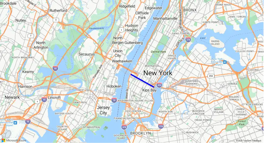
A polyline is a series of connected straight-line segments, forming either an open or continuous line. These paths are defined by their start and end points, including any intermediate vertices. They represent linear features on maps, such as roads, trails, or wires. For example, if you’ve ever checked driving directions on a mapping app, the highlighted route is a polyline.
Common Use Cases for Polylines
Polylines are versatile, making them suitable for actualizing effective data visualization across industries. Here are some prominent applications:
- Route Visualization: Map out driving paths, public transit routes, or shipping lanes.
- Custom Overlays: Enable private use cases, such as mapping delivery paths or hiking trails.
- Infrastructure Mapping: Track transportation infrastructure, communication lines, or utility layouts.
How Polylines Improve Visualization
Polylines act as an analytical tool to highlight connectivity and movement. By aligning spatial data with real-world applications, polylines help industries pinpoint inefficiencies, improve routes, and optimize planning. Logistics companies, for instance, use polylines to chart delivery routes and reduce travel time.
Exploring Map Polygons
Polygons are ideal for depicting closed spatial areas, enabling the effective visualization of geographic regions and their associated data.
What Are Polygons?
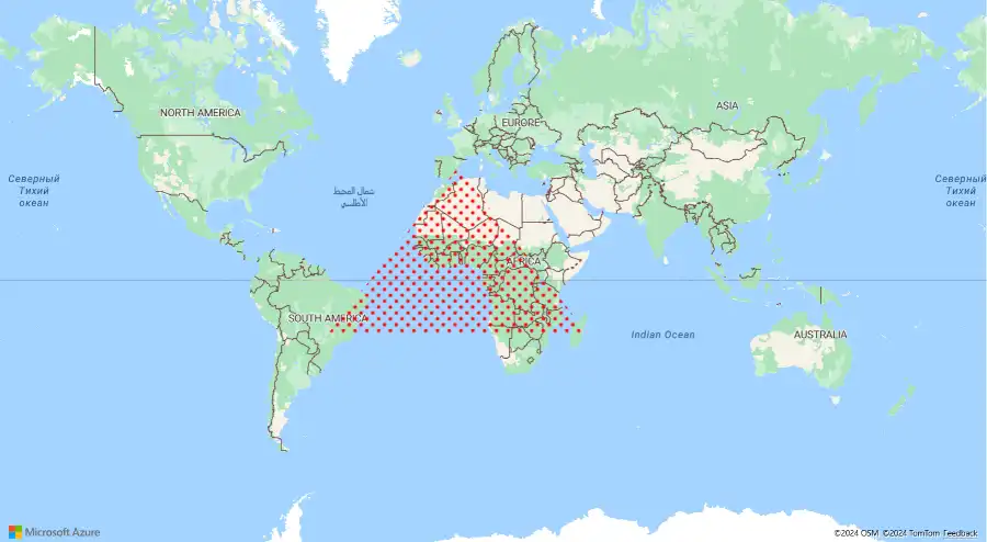
Polygons are shapes drawn by connecting three or more straight lines, forming a closed area. Unlike polylines, polygons highlight-filled regions. These shapes are essential for understanding spatial zones and offering meaningful visual context. Examples include country boundaries, city layouts, or thematic heat maps.
Key Applications of Polygons
Polygons serve a wide variety of purposes across industries:
- Geographic Boundaries: Mark the edges of administrative divisions like states, provinces, or countries.
- Zone Mapping: Use polygons to display service areas, environmental zones, or high-traffic areas.
- Spatial Data Representation: Visualize population densities, vegetation coverage, or economic activities.
Strengths of Polygons for Effective Data Visualization
Polygons are especially valuable for spatial insights. Urban planners, for example, use polygons for zoning plans, indicating residential, industrial, or commercial territories. Similarly, retailers rely on polygons to map target demographics or assess competitive territories. Polygons transform raw data into clear visuals. From helping marketers analyze performance regionally to aiding conservation efforts, polygons can translate intricate statistics into digestible graphics.
Using Polylines and Polygons Together
Pairing polylines and polygons opens up more possibilities for robust visualizations. Their combination allows users to represent multidimensional data effectively.
Geofencing and Navigational Paths
Combining polylines with geofencing-purposed polygons provides richer insights. For example, airlines can draw polylines for flight routes while using map polygons to define no-fly zones. Similarly, shipping companies can match delivery routes with service coverage areas to ensure optimal delivery strategies. Combining these elements helps ensure more effective data visualization in unique applications.
Applications in Business and Services
Pairing these tools benefits decision-making in sectors like logistics, retail, and real estate. Service companies may use polygons to map out territories and polylines to optimize routes within these zones. Similarly, real estate developers can overlay polygons to indicate property boundaries while adding polylines to guide potential buyers through nearby roads and transit hubs.
Travel Planning with Polygons and Polylines
In travel, polygons are often used to map regions that can be reached within a specific timeframe—such as 30-minute travel zones. Meanwhile, polylines can highlight detailed paths, such as driving routes. Together, they provide travelers with a comprehensive understanding of destinations and the routes to reach them.
Harnessing Azure Maps for Effective Data Visualization
Once you understand the potential of polylines and polygons, the next step is choosing the right platform to leverage them. Azure Maps is a highly regarded choice, offering robust tools for creating extensive and detailed map-based visualizations.
Creating Polygons and Polylines in Azure Maps
Azure Maps simplifies the process of managing spatial data. Users can import datasets to design and display polygons and polylines on both interactive and static maps. The platform supports multiple layers, allowing for the integration of polyline data alongside polygon overlays. For instance, you can create multiple service area polygons and then overlay them with delivery routes defined as polylines. Explore Azure’s highly effective data mapping and visualization tools for seamless integration into your projects.
Customization for Enhanced Clarity
Azure Maps is highly flexible. You can assign custom colors, group-related data, and add tags or symbols for better map comprehension. Whether you’re using polylines to showcase movement or polygons to clarify boundaries, these features allow you to create tailored visuals aligned with your goals.
Real-World Examples of Azure Maps Use
Several industries are harnessing the potential of Azure Maps’ capabilities. Delivery services use map polygons to create service regions and employ polylines to optimize delivery routes. Retailers use polygons to highlight market locations and analyze regional sales patterns. Urban planners utilize both tools to map residential zones and infrastructure growth.
Explore the Platform to Learn More
Polygons and polylines are foundational tools for any effective geospatial data visualization project. They allow you to represent linear data, enclosed regions, or both simultaneously. By offering a clear and actionable format for spatial analysis. Platforms like Azure Maps allow seamless implementation of these tools, empowering industries with data-driven solutions. Polylines and polygons help clarify movement, boundaries, and relationships, enabling better decision-making and communication.
By leveraging them in your business or analytical workflows, you can simplify complex data and gain actionable insights. Explore Azure Maps today to start enhancing your mapping and visualization needs with the right toolsets. Start building for free.